




















PWHL Unveils Detroit Clutch, Hamilton Havoc, Vegas Vanguards and San Jose Sea Lions Ahead of Season Four
The PWHL revealed identities for its four expansion teams on Tuesday, with opening weekend set for Dec. 5-6 and city-branded jerseys coming first.
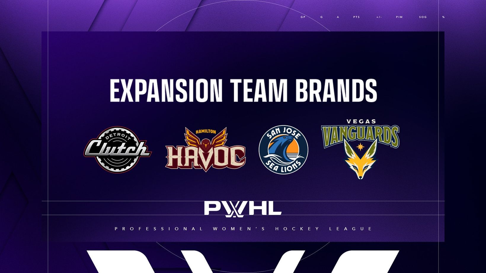
The Professional Women's Hockey League just put names, colors and animals on the next phase of the map.
On Tuesday the league unveiled the identities of its four expansion teams: the Detroit Clutch, the Hamilton Havoc, the Vegas Vanguards and the San Jose Sea Lions. The brands arrive ahead of each club's inaugural 2026-27 season, with PWHL Season Four set to open Dec. 5-6, according to the official announcement.
Merchandise featuring the new marks is already for sale through the PWHL Online Shop. The logos will not hit the ice in full just yet. Expansion teams will wear city-branded jerseys in their first season, and the new logos will move onto redesigned jerseys in year two, the league said.
Detroit Clutch
Detroit's name leans into two things the city already claims as its own: the automobile, and the habit of delivering when the moment tightens. The league said Clutch ties Detroit's history of automotive innovation to those sports instants when a team has to finish under pressure.
The circular logo is built like a wheel and an automotive clutch, with a chrome, Art Deco-inspired wordmark. Vinyl lines run inside the wheel as a nod to Motown. The primary palette is motor black, clutch chrome, hot white and racing red, which the league tied to precision and grit.
Hamilton Havoc
Hamilton's identity sits at the meeting point of the steel mills and the Niagara Escarpment. The league described a city of creators and builders, where disruption has long made room for reinvention, and it wants the team tested in the same way.
The Havoc logo is anchored by Hamilton's official bird, the peregrine falcon, rendered in steel with molten eyes and paired with heavy, steel-forged lettering. The colors are rusted metal, molten steel, falcon ivory and flame orange, a palette the league said reflects a place where nature and industry share the same skyline.
San Jose Sea Lions
San Jose went to the water. The Sea Lions name points to the Bay Area coastline and to a species the league called intelligent, agile and fiercely protective of its colony. The emblem at the center of the logo is a sea lion, set against a setting sun, with typography the league described as modern.
The colors are coastal blue, sunset orange, tidal navy and sea mist. There is a deeper sports hook, too. The league noted a connection to the San Francisco Sea Lions of the West Coast Negro Baseball Association, who played in 1946 and featured Toni Stone, the first woman to play baseball regularly in a major men's professional league.
Vegas Vanguards
Las Vegas chose a name about going first. Vanguards, the league said, is meant to honor people who lead the way, take on hard jobs and open new ground, a nod to the pioneering streak that helped shape the West.
The logo features the kit fox, a Mojave Desert native the league described as adaptable and resilient, with Las Vegas' star set between a V silhouette above the animal. The typography pulls from the American frontier. The palette is cactus green, fox ivory, desert gold and midnight navy, colors the league tied to the desert around the city.
A process the league says was built close to home
Amy Scheer, the PWHL's executive vice president of business operations, framed the launch as a milestone the league's fans had been waiting on, and as work that tried to stay specific to each market.
"Our fans have been eagerly waiting for this moment, and we're excited to officially introduce these new team identities as we mark another major milestone for the PWHL," Scheer said in the announcement. "We approached this process with great care, creating team names and logos that reflect the character and pride of each community, while staying connected to the PWHL. As we've seen with our first eight teams, these brands will take on even greater meaning as they are embraced and shaped by our fans and players, ultimately becoming a source of pride and a rallying cry for the communities they represent."
Women-led PWHL design teams led the work, the league said. The logos for Las Vegas and San Jose included collaboration with creative agency Doubleday & Cartwright.
What it means
This takes the PWHL from eight teams to twelve, and it does it with four very different bets: an auto town, a steel city, a Bay Area coastline and the desert. The names are not generic. They are specific enough to argue about, which is usually the point of a good sports brand.
The calendar is tight. Opening weekend is Dec. 5-6, and the first-year uniforms will still be the city marks, not these new crests. That gives the clubs a season to let the names settle before the logos take over the sweaters. It also means the first impression in the building will be the city itself, with the new identity arriving in the shop and on screens first.
For a league that has spent its early years proving it belongs, this is the expansion that makes the map look like a major circuit. Detroit, Hamilton, Las Vegas and San Jose now have names to chant and colors to wear. The hard part starts in December, when the brands have to survive the only test that counts: the scoreboard.
Four logos will not win a playoff series. They can, however, give four new markets something to hold onto before the first puck drops. On Tuesday, the PWHL handed them that. The rest is for the ice.
Here is the PWHL's official announcement (opens in a new tab). More PWHL coverage on Undrafted.
Sources: The Professional Women's Hockey League.
Photo: PWHL

More From Editor
View All stories by Editor
Jaguars Load Up on Defense and the Colts Deal Keenan Allen and Josh Downs as the NFL Trade Deadline Closes
November 11, 2026
Ryan Day Hands Ohio State's Special Teams to Rob Keys for the Rest of 2026 After Firing Robby Discher
November 10, 2026

Raiders Trade Kirk Cousins to the Vikings for a 2027 Third-Round Pick, Sending Him Back to Kevin O'Connell
November 10, 2026